Our Philosophy Of Nothingness.
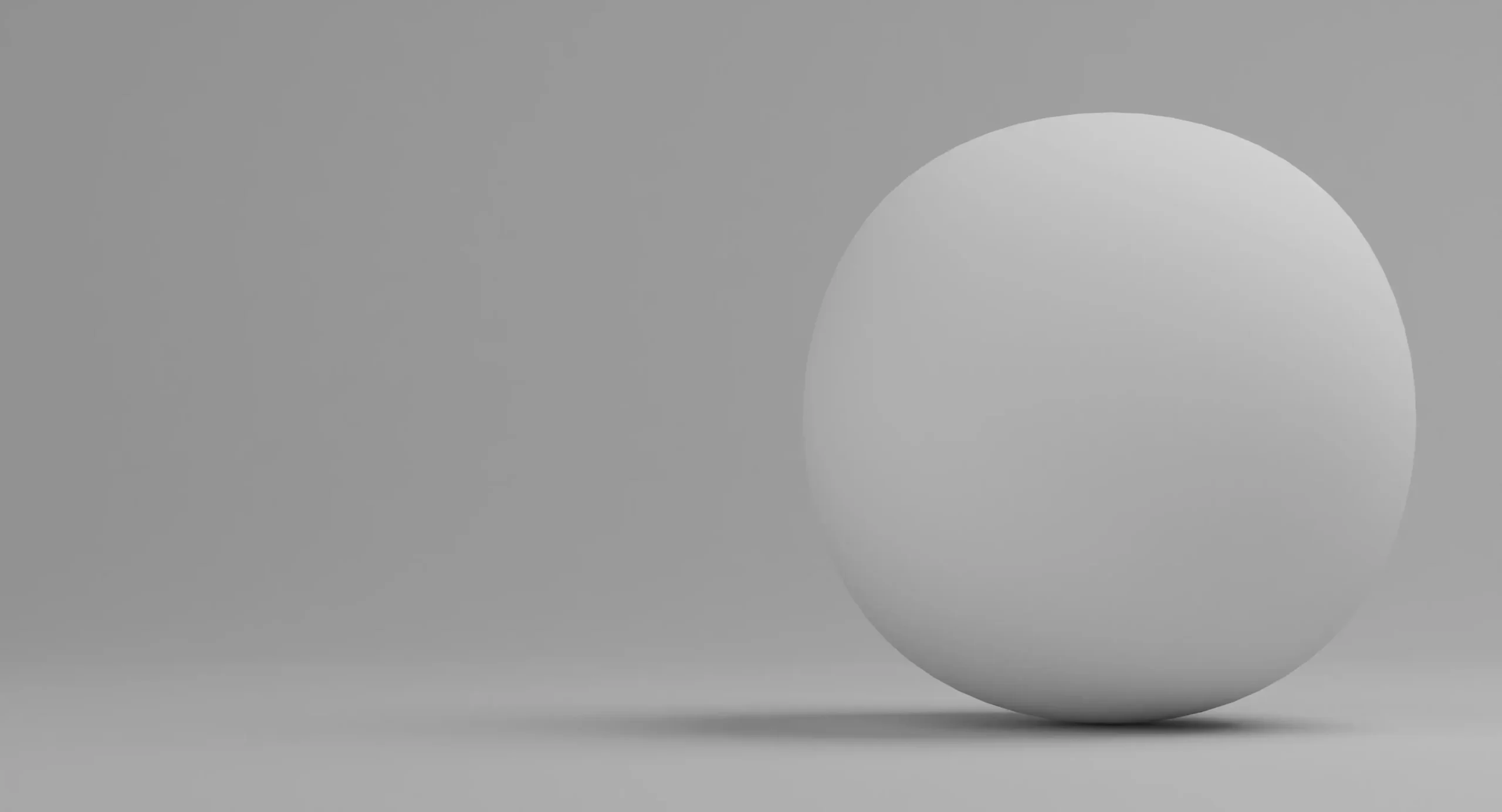
The Beauty of Nothingness and Negative Space
Minimal in Look. Maximum in Purpose.
In the modern world—filled with noise, distractions, and endless clutter—the most powerful statement a designer or brand can make is to say less.
To intentionally leave space. To let a product, a word, or a shape breathe.
That’s where the beauty of nothingness and negative space begins.
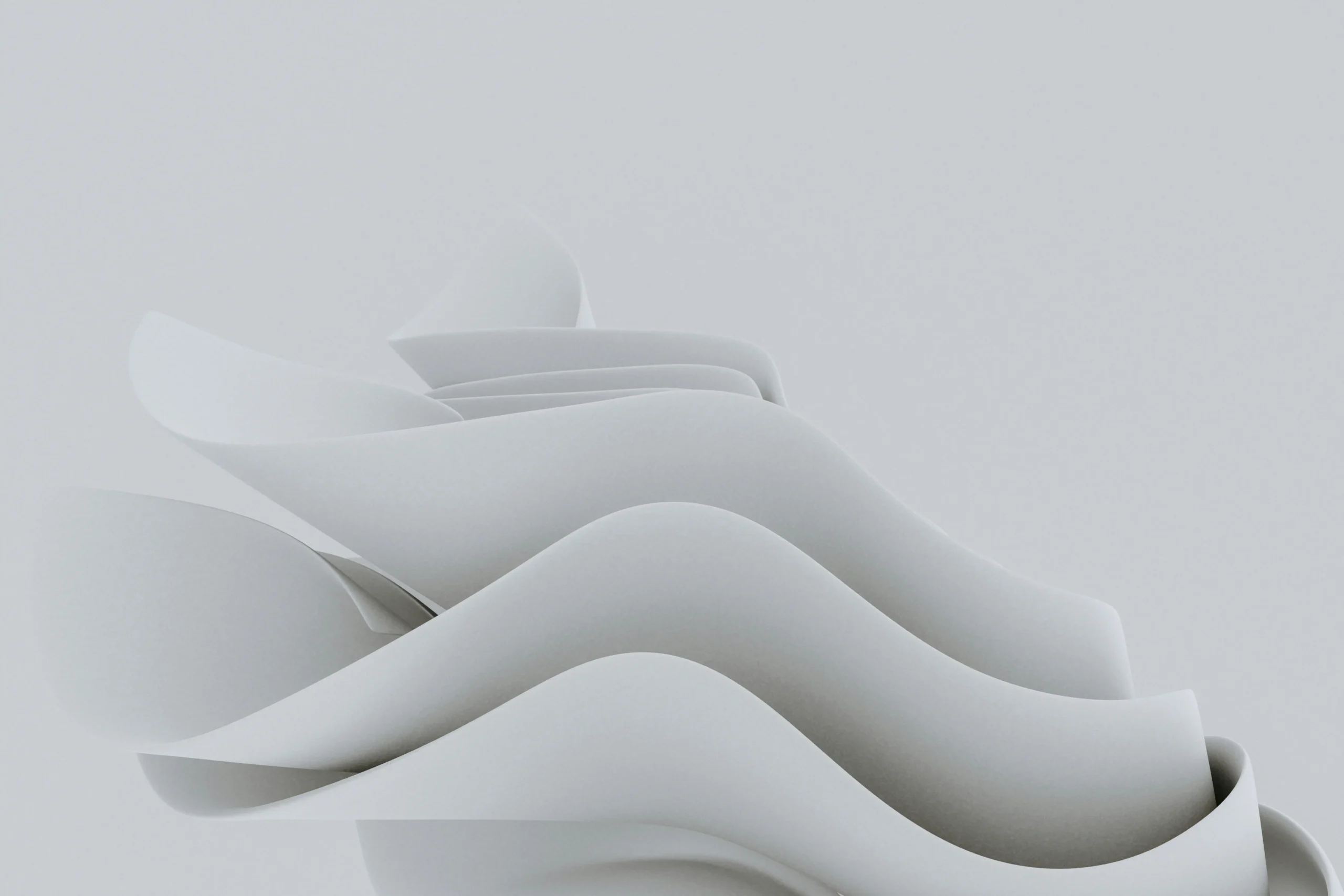
Nothingness Isn’t Empty — It’s Meaningful
When we hear “nothing,” we often think of absence or void. But in art, design, architecture—and even in philosophy—nothingness is full of meaning. It’s the quiet moment in a conversation that says more than words.
It’s the blank area around a product image that makes it stand out.
In Japanese aesthetics, this is called “Ma” — the space between things, which defines their shape, their purpose, and their identity.
At Store For Shops, we embrace this concept in everything we design, curate, and showcase. The way we present a shelf, a display unit, or even a price tag — it’s all about what we leave out, not just what we include.
Negative Space Is Not Background. It’s Intent.
In visual design, negative space refers to the area around and between the subject.
Most people think it’s “blank” or “unused”. But here’s the truth:
Negative space tells your story just as much as your content.
When you look at a thoughtfully crafted product display—where items aren’t crammed together, but have room around them—it creates focus. It builds elegance. It makes the customer stop and feel.
Whether it’s a simple garment hanger or a premium acrylic stand, how you frame the product matters. Negative space helps define luxury, simplicity, and precision.
And in our design philosophy, less is not less—it’s laser focus.
Why We Value Nothingness in Retail Design
In retail environments, clutter kills clarity. Overdesign confuses customers. Too much information becomes no information at all.
That’s why we design fittings, display racks, and shop interiors that reflect purpose over decoration.
We don’t just sell retail accessories.
We design spaces that sell — by using nothingness as a tool.
Each gap between shelves, each margin on a product label, each untouched portion of a store wall—it all contributes to a better customer journey.
Our goal is not to fill the space.
Our goal is to let your product own the space.
The Philosophy of Minimalism: Form Follows Purpose
Minimalism is not a trend. It’s a timeless design principle.
It’s about knowing what to remove so what remains has more impact.
In our world of shop fittings, signage, and product displays, this principle guides everything we do:
- We use clean lines and neutral palettes.
- We avoid decorative noise unless it enhances usability.
- We prioritize customer navigation, not brand noise.
Because when your customer walks in, they should instantly know where to look, what to touch, and what to buy. That’s the power of negative space in action.
From Storefronts to Screens — Digital Minimalism Too
Our digital experience follows the same principle.
From our product pages to pricing details, every piece of content is built with clarity and restraint. We don’t overload visitors with popups, flashy banners, or endless scrolling.
Why?
Because digital clutter is just as harmful as physical clutter.
We believe in clear content, honest design, and minimalist structure.
Our philosophy is simple:
The more noise we remove, the more trust we build.
Nothingness is Where Imagination Begins
When space is left empty—it invites imagination.
It gives the mind room to wonder, to explore, and to connect. Whether you’re a store owner designing your dream retail space, or a customer browsing through product options — it’s the space we leave open that lets you envision what comes next.
In this emptiness, you’re free to create, adapt, and grow.
We Don’t Just Design Products. We Design Possibility.
We believe that a well-placed gap is as powerful as a feature.
That a clean product image sells more than a cluttered collage.
That a blank space is not a loss — it’s an invitation.
This is why Store For Shops builds its identity around the idea that
Minimal in Look. Maximum in Purpose.
Because in the beauty of nothingness, everything begins.
Complete Philosophy of Nothingness in Website Design: How Emptiness Creates Digital Meaning
What if the most powerful element in your website design isn’t what you add, but what you deliberately leave out? The philosophy of nothingness in website design isn’t about creating empty, boring pages—it’s about understanding how strategic emptiness can create more meaningful, impactful digital experiences than cluttered, overwhelming interfaces.
In our attention-economy world where every pixel seems to scream for user engagement, applying the philosophy of nothingness to web design represents a radical shift. It’s about recognizing that sometimes the most profound communication happens in the spaces between words, the pause between notes, and the emptiness between design elements.
This isn’t just aesthetic minimalism—it’s a philosophical approach that transforms how users interact with digital spaces, how information is processed, and how meaningful connections are formed between humans and technology.
Understanding Nothingness in Digital Design Context
Beyond Simple Minimalism
When we talk about the philosophy of nothingness in website design, we’re going deeper than surface-level minimalism. Minimalism is about breaking things down to the barest elements necessary for a design to function, but the philosophy of nothingness asks more fundamental questions: What happens when we intentionally create spaces of emptiness? How does absence communicate meaning?
In philosophical terms, nothingness isn’t merely the absence of something—it’s an active force that gives meaning to what exists. Similarly, in web design, strategic emptiness doesn’t just remove clutter; it actively enhances the elements that remain, creating hierarchy, focus, and emotional resonance.
The philosophy of nothingness in design recognizes that empty space isn’t wasted space—it’s potential space. It’s where users’ minds can rest, where important elements can breathe, and where the most crucial interactions can happen without distraction.
The Psychology of Digital Emptiness
Human psychology responds powerfully to emptiness in digital interfaces. When users encounter thoughtful negative space, their brains don’t register it as “nothing”—they register it as intentional communication. This empty space creates what psychologists call “processing fluency,” making it easier for users to understand and interact with your content.
Research in cognitive psychology shows that cluttered interfaces increase cognitive load, making it harder for users to make decisions and complete tasks. By applying the philosophy of nothingness, we reduce this cognitive burden, allowing users to focus on what truly matters.
The emptiness becomes a form of digital hospitality—creating breathing room for users’ thoughts and emotions, rather than overwhelming them with constant stimulation.
The Philosophical Roots of Digital Nothingness
Eastern Philosophy Meets User Experience
The philosophy of nothingness in web design draws heavily from Eastern philosophical traditions, particularly the concept of ma in Japanese aesthetics. In Japanese culture, it’s known as the ma principle: treating the negative space as just as important as positive elements.
Ma isn’t just empty space—it’s pregnant pause, meaningful silence, intentional absence that creates anticipation and focus. When applied to web design, ma transforms white space from a design afterthought into a primary design element that actively shapes user experience.
Buddhist concepts of emptiness (śūnyatā) also inform this approach. Just as Buddhist philosophy suggests that emptiness allows for infinite potential, empty space in web design creates potential for user interaction, imagination, and meaningful engagement with content.
Western Existentialism in Digital Spaces
Western existentialist philosophy also contributes to understanding nothingness in web design. Jean-Paul Sartre’s concept that “existence precedes essence” translates powerfully to digital design: the function and experience of a website should determine its form, not predetermined aesthetic conventions.
When we apply existentialist principles to web design, we strip away elements that don’t serve authentic user needs. We create digital spaces that reflect genuine human priorities rather than design trends or marketing pressures.
This existentialist approach to web design asks: What would this website be if we removed everything that doesn’t directly serve user goals? What emerges when we confront the nothingness of unnecessary design elements?
Negative Space as Digital Philosophy
The Power of Strategic Emptiness
Negative space (also called white space) is the name given to the empty areas of an interface. Negative space has been called “practically synonymous with” and “the backbone of” minimalist interfaces. But in the philosophy of nothingness approach, negative space becomes much more than a design technique—it becomes a philosophical statement about digital communication.
Strategic emptiness in web design serves multiple philosophical functions:
- Contemplative Space: Empty areas provide mental breathing room, allowing users to process information and emotions without overwhelming stimulus.
- Intentional Focus: By surrounding important elements with emptiness, we declare their significance without resorting to flashy animations or aggressive design tactics.
- Digital Mindfulness: Thoughtful use of negative space encourages users to be present with content rather than rushing through it mindlessly.
The Hierarchy of Absence
Just as silence in music creates rhythm and meaning, different types of emptiness in web design create different experiences. Tight negative space around text creates readability and flow. Generous negative space around key elements creates emphasis and gravitas. Vast empty spaces can create feelings of openness, possibility, or even digital solitude.
Understanding the hierarchy of absence means recognizing that not all empty space serves the same purpose. Some emptiness invites interaction, some encourages contemplation, and some simply provides relief from information density.
Practical Applications of Nothingness Philosophy
Content-First Design Approach
The philosophy of nothingness in web design naturally leads to content-first approaches. Instead of starting with visual templates and filling them with content, nothingness philosophy asks: What does this content need to communicate effectively? What would serve this communication best—additional elements of strategic emptiness?
This approach often reveals that less is genuinely more. Headlines become more impactful when surrounded by space. Call-to-action buttons gain power when they’re not competing with dozens of other elements. Navigation becomes clearer when it’s not cluttered with every possible option.
- Content Breathing Room: Give your most important content generous space to exist without competition. A single, well-crafted paragraph surrounded by white space often communicates more effectively than multiple paragraphs crammed together.
- Visual Hierarchy Through Absence: Use varying amounts of negative space to create natural reading patterns and priority levels without relying on color or size alone.
Typography and the Void
Typography becomes particularly powerful when informed by nothingness philosophy. The space between letters (kerning), words, and lines isn’t just technical spacing—it’s philosophical communication about pacing, emphasis, and respect for the reader’s cognitive process.
Large, bold headlines surrounded by significant white space don’t just look modern—they create moments of pause and consideration. They invite users to actually read and process the words rather than skimming past them.
Generous line spacing and paragraph breaks create what we might call “textual ma”—pauses that allow ideas to settle and resonate before moving to the next concept.
Navigation and Intentional Limitation
The philosophy of nothingness challenges conventional wisdom about navigation design. Instead of trying to make every possible page accessible from every other page, nothingness philosophy asks: What navigation serves the user’s actual journey? What would happen if we removed options that don’t support core user goals?
This often leads to simplified navigation that guides users through intentional paths rather than overwhelming them with choices. The absent navigation options aren’t missing—they’re strategically removed to create clearer, more meaningful user experiences.
- Progressive Disclosure: Reveal navigation options only when they become relevant to the user’s current context, rather than showing everything at once.
- Contextual Simplicity: Each page should present only the navigation options that make sense for that specific moment in the user journey.
Visual Elements and Philosophical Emptiness
Color Palettes and the Void
The philosophy of nothingness profoundly impacts color choices in web design. Rather than using color to fill every available space, nothingness philosophy treats color as punctuation—strategic moments of visual emphasis against backgrounds of neutral calm.
Monochromatic or severely limited color palettes aren’t just trendy—they’re philosophical statements about focus, clarity, and respect for user attention. When color appears in a mostly neutral interface, it carries enormous communicative weight.
This approach often leads to designs that feel both sophisticated and approachable, avoiding the visual noise that can make websites feel chaotic or overwhelming.
Images and Strategic Absence
In a world of stock photo overload, the philosophy of nothingness asks powerful questions about imagery: Does this image serve the user’s goals, or is it just filling space? What would happen if we used fewer, more meaningful images? How does the absence of expected imagery change the user’s relationship with our content?
Sometimes the most powerful visual choice is no image at all—allowing text, white space, and typography to carry the full communicative load. This can create surprisingly intimate and focused user experiences.
When images are used, they gain tremendous power through their scarcity and careful selection. Each image becomes a deliberate choice rather than decorative filler.
Interactive Elements and Restrained Engagement
The philosophy of nothingness challenges the conventional wisdom that websites should maximize user engagement through constant interactive opportunities. Instead, it asks: What interactions truly serve user needs? What would happen if we removed engagement mechanics that don’t support core goals?
This often leads to cleaner, more purposeful interaction design. Buttons, forms, and interactive elements gain clarity and effectiveness when they’re not competing with dozens of other engagement opportunities.
- Intentional Interaction: Every clickable element should serve a clear purpose in the user’s journey, not just increase engagement metrics.
- Restrained Animation: Motion and animation, when used, should enhance communication rather than simply attracting attention.
User Experience Through Nothingness
Cognitive Load and Digital Wellness
The philosophy of nothingness directly addresses growing concerns about digital wellness and cognitive overload. By intentionally creating spaces of emptiness and calm, we can design websites that restore rather than deplete user energy.
The goal of minimalist web design should be to present content and features in a simple, direct way by providing as little distraction from the core content as possible. This isn’t just good usability—it’s digital ethics, recognizing our responsibility for users’ mental well-being.
Websites designed with nothingness philosophy often feel like relief in a cluttered digital world. Users can accomplish their goals without fighting through layers of distraction and irrelevant information.
Attention and Intentionality
In our attention economy, the philosophy of nothingness becomes a form of resistance against exploitative design patterns. Instead of maximizing time-on-site through addictive design patterns, nothingness philosophy prioritizes user satisfaction and goal completion.
This approach often creates more loyal users who associate your brand with clarity, respect, and efficiency rather than confusion and manipulation.
- Respectful Design: Honor users’ time and attention by removing elements that don’t serve their goals.
- Clear Pathways: Use negative space and strategic absence to create obvious, friction-free paths to user objectives.
Mobile-First Nothingness
The philosophy of nothingness becomes even more critical in mobile design, where screen real estate is limited and user attention is often divided. Mobile interfaces designed with nothingness philosophy prioritize essential functions and information while removing everything that doesn’t serve the mobile use context.
This isn’t just responsive design—it’s a philosophical adaptation to how people actually use mobile devices. The constraints of mobile screens become opportunities to practice digital minimalism and intentional design.
Business Impact of Philosophical Design
Conversion Through Clarity
Businesses often worry that removing elements from their websites will reduce conversions, but the philosophy of nothingness frequently produces the opposite result. When users can clearly understand what you’re offering and how to take action, conversion rates often improve dramatically.
Clean, focused design removes friction from the conversion process. Users don’t have to fight through cluttered interfaces to understand your value proposition and take desired actions.
- Focused Value Proposition: Surround your core message with enough white space to ensure it gets full attention.
- Simplified Conversion Paths: Remove steps, fields, and options that don’t directly support conversion goals.
Brand Differentiation Through Restraint
In a world of visually noisy websites, restraint becomes a powerful differentiator. Brands that embrace the philosophy of nothingness often stand out precisely because they’re not fighting for attention in conventional ways.
This approach can position your brand as sophisticated, confident, and user-focused—qualities that increasingly matter to conscious consumers who are tired of digital overwhelm.
Performance and Philosophical Alignment
The philosophy of nothingness naturally leads to better website performance. Fewer elements mean faster loading times, reduced server requests, and better mobile experiences. The philosophical and technical benefits align perfectly.
Users increasingly expect fast, efficient digital experiences. The philosophy of nothingness delivers both philosophical satisfaction and practical performance improvements.
Common Misconceptions About Design Nothingness
“It’s Just Empty and Boring”
The biggest misconception about applying nothingness philosophy to web design is that it produces boring, empty websites. In reality, thoughtful emptiness creates more engaging experiences by allowing important elements to shine without competition.
The goal isn’t to create sterile, lifeless designs—it’s to create spaces where meaningful interaction and communication can flourish without distraction.
“It Doesn’t Work for Complex Websites”
Another common misconception is that nothingness philosophy only works for simple websites with minimal content. Complex websites can benefit enormously from philosophical approaches to emptiness through progressive disclosure, clear information hierarchy, and strategic use of white space.
The philosophy becomes even more valuable as complexity increases—helping users navigate sophisticated systems without cognitive overload.
“It’s Just a Trend”
Some dismiss the philosophy of nothingness in design as just another trend that will pass. But the underlying principles—respect for user attention, clarity of communication, and intentional design choices—represent fundamental shifts in how we think about digital ethics and user experience.
These aren’t surface-level aesthetic choices but deep philosophical commitments to how digital spaces should serve human needs.
Technical Implementation of Philosophical Principles
CSS and the Art of Absence
Implementing the philosophy of nothingness requires technical skills that support philosophical intentions. CSS properties like margin, padding, and negative space become tools for creating meaningful emptiness rather than just visual spacing.
- Generous Margins: Use margins to create breathing room around important elements, not just to separate content blocks.
- Strategic Padding: Internal spacing should support content hierarchy and reading flow.
- Responsive Emptiness: Ensure that negative space scales appropriately across different screen sizes and devices.
Performance Optimization as Philosophy
The technical practice of performance optimization aligns perfectly with nothingness philosophy. Removing unnecessary scripts, optimizing images, and eliminating redundant code serves both philosophical and practical goals.
Every removed element improves both the user experience and the website’s performance metrics. The philosophy and the technology support each other naturally.
Accessibility Through Simplicity
The philosophy of nothingness often improves website accessibility by creating clearer visual hierarchies, reducing cognitive load, and simplifying navigation patterns. Screen readers work better with clean, well-structured HTML that isn’t cluttered with decorative elements.
Simple, focused designs are easier for users with cognitive disabilities to navigate and understand. The philosophical commitment to clarity serves accessibility goals.
Future of Nothingness in Digital Design
Emerging Technologies and Philosophical Design
As new technologies like AR, VR, and AI interfaces emerge, the philosophy of nothingness becomes even more relevant. These immersive technologies can easily overwhelm users with sensory input, making thoughtful emptiness and strategic absence crucial for usable experiences.
Voice interfaces already embody nothingness philosophy—they’re entirely about removing visual elements and focusing on essential communication. As interfaces become more ambient and integrated into our environments, the principles of philosophical emptiness will guide their development.
Digital Wellness and Conscious Design
Growing awareness of digital wellness and screen time concerns makes the philosophy of nothingness increasingly relevant to both designers and users. Websites designed with intentional emptiness can provide moments of digital calm in an increasingly stimulating online environment.
This represents a shift from attention-grabbing design to attention-respecting design—a philosophical change that will likely influence web design for years to come.
Artificial Intelligence and Intentional Simplicity
As AI tools make it easier to generate complex designs and interactions, the philosophy of nothingness provides a counterbalance—ensuring that human judgment and intentionality guide design decisions rather than just technical capability.
AI can help identify what elements are truly necessary for user goals, supporting the philosophical process of removing what doesn’t serve authentic human needs.
Measuring Success in Philosophical Design
Metrics That Matter
Traditional web metrics like time-on-site and page views don’t always align with the goals of nothingness philosophy. More meaningful metrics might include:
- Task Completion Rate: How easily do users accomplish their actual goals?
- User Satisfaction: Do users feel good about their experience on your site?
- Return Intent: Do users want to come back based on the quality of their experience?
- Cognitive Load Assessment: How mentally taxing is it to use your website?
Qualitative Assessment
The philosophy of nothingness often produces benefits that are difficult to measure quantitatively but profoundly impact user experience. User feedback, qualitative research, and observational studies become crucial for understanding the full impact of philosophical design choices.
Pay attention to how users describe their experience with your site. Words like “clear,” “calming,” “easy,” and “focused” indicate successful implementation of nothingness principles.
Practical Exercises for Implementing Nothingness
The Subtraction Audit
Start with your existing website and practice philosophical subtraction:
- Element Inventory: List every element on your key pages
- Purpose Assessment: For each element, identify its specific purpose and how it serves user goals
- Strategic Removal: Remove elements that don’t directly support user objectives
- Space Observation: Notice how the removal of elements changes the feel and function of the remaining design
The White Space Experiment
Deliberately increase white space around your most important elements:
- Identify Priority Elements: What are the most crucial pieces of information or interaction on each page?
- Create Breathing Room: Surround these elements with generous negative space
- Observe Impact: Notice how increased white space changes user attention and interaction patterns
- Refine Balance: Adjust spacing until you achieve the right balance of emphasis and calm
The One-Thing Pages
Create pages that focus on just one primary action or piece of information:
- Single Purpose: Each page should have one clear, primary purpose
- Remove Distractions: Eliminate navigation, sidebar content, and other elements that don’t support the primary purpose
- Measure Results: Compare conversion rates and user satisfaction on simplified pages versus complex ones
Conclusion: Embracing the Void in Digital Design
The philosophy of nothingness in website design isn’t about creating empty, lifeless digital spaces—it’s about understanding how strategic emptiness can create more meaningful, effective, and humane user experiences. In a world overwhelmed by digital noise, the thoughtful application of nothingness principles offers both designers and users a path toward clarity, focus, and authentic digital communication.
This philosophical approach challenges us to question every design decision: Does this element serve the user’s genuine needs? Does this interaction create value or just engagement? What would happen if we removed everything that doesn’t directly support human goals and left only what truly matters?
The answers to these questions often reveal that less is indeed more—not because emptiness is inherently better, but because strategic absence allows what remains to communicate with greater power and clarity. White space improves the user experience by making your copy readable and enabling users to focus on other important visual elements on the page.
As we move forward in an increasingly complex digital landscape, the philosophy of nothingness offers a framework for creating websites that respect user attention, reduce cognitive load, and facilitate meaningful interactions between humans and technology. It’s not just a design methodology—it’s a form of digital ethics that prioritizes human well-being over engagement metrics.
The void isn’t empty—it’s full of potential. The pause isn’t absent—it’s pregnant with meaning. The white space isn’t wasted—it’s where the most important communication happens. By embracing the philosophy of nothingness in our digital design practice, we create spaces where users can breathe, think, and connect with content in ways that honor both their intelligence and their humanity.
Whether you’re designing a simple landing page or a complex web application, the principles of nothingness philosophy can guide you toward solutions that are not only more beautiful and functional but also more ethical and sustainable in our attention-scarce world. The question isn’t whether you can afford to embrace emptiness in your design—it’s whether you can afford not to.
Frequently Asked Questions
Q: How is this different from regular minimalist web design?
A: While minimalism focuses on reducing visual elements, the philosophy of nothingness goes deeper to examine the meaning and impact of emptiness itself. It’s not just about fewer elements, but about understanding how strategic absence creates psychological and emotional effects on users.
Q: Won’t removing elements hurt my SEO and content marketing?
A: The philosophy of nothingness actually supports SEO by improving user experience metrics like time-on-page, bounce rate, and task completion. Search engines increasingly prioritize user satisfaction, which often improves when content is presented clearly without distractions.
Q: How do I convince clients that “less” is worth paying for?
A: Focus on business outcomes: improved conversion rates, better user feedback, reduced development complexity, and faster loading times. The philosophy of nothingness often produces measurable improvements in the metrics that matter most to business success.
Q: Can e-commerce sites use nothingness philosophy?
A: Absolutely. E-commerce sites often benefit enormously from strategic emptiness that helps products stand out, simplifies decision-making, and reduces cognitive load during the purchasing process. Clean product pages with generous white space often convert better than cluttered ones.
Q: How do I know if I’ve removed too much?
A: Test with real users and monitor key metrics. If task completion rates drop or users report confusion, you may have removed essential elements. The goal is to remove everything that doesn’t serve user needs while keeping everything that does.